

The dilemma of Colour and Monochrome
- Indranil Mukherjee

- Jun 8, 2019
- 4 min read
In the previous issue of this column, we had a very good discussion on digital platform and hard copy prints of photographs. The article was concluded with the question of selecting an image to be colour printed or in black and white. We are glad to have received so many mails in this connection. Lets make this discussion open to all.
Now coming back to the example of photo albums once again. When my parents showed me the albums to introduce me to my ancestors, I found my great grandfather posed in a white dhoti and black coat, sitting on a properly polished wooden black chair. But when slowly the time rolled to my grand father’s time, I saw him with a yellow shirt and a brown pant, posing in a garden with green grass and red flowers. This means, colour photography was adopted as a practice much later than the black and white.
History says, the first color photograph was made by the three-color method suggested by James Clerk Maxwell in 1855, taken in 1861 by Thomas Sutton. The subject is a colored ribbon, usually described as a tartan ribbon. The image looks somewhat as below:

Pic1: “Tartan Ribbon”-The First Colour Photograph
Now before we proceed, let me highlight the technical part of the term used as black and white. The terms “black and white” and “monochrome” are often used interchangeably. Such usage isn’t always incorrect, but there is some nuance that should be addressed. A monochrome image is one that consists of varying tones of one “color.” If technically spoken, Black and White is ideally to be called Grey-scale, which is a type of Monochrome, where you find all the pixels of the image as different tones of Grey Colour, ranging from Black to White. Grey-scale is one of the most widely used monochrome, but nowadays we also find other monochrome options getting familiar through instant filter in various social media apps and post processing software presets. One of the most commonly used is Sepia.


Pic2: Greyscale and Sepia type of Monochrome
Now suppose you plan to go out for a shoot with no specific agenda or subject in your mind, but just want a day to be spent for yourself and your passion. You roamed across the streets, found some vendors at work, some nice architectures, some street food, smiling kids, old women and wrinkled skins, some late evening traffic lights, and may be few more. You return with a bagfull of satisfied shots, connect your cam to your PC and upload th images to post process. Now comes the major conflict: Monochrome or Colour? Let us try to clear such conflicts in you by some easy steps. Start to question yourself the following:
· Role of Colour: At few instances, a colour may be a distraction, but at times its necessity. Colour is always a subjective requirement. Suppose the street food images that you have clicked, which consists of a nice mango shake with dates on top. If you turn it to monochrome, first and foremost thing, the viewer loses an information of what flavour the drink is. Moreover, the temptataion factor also gets diminished. But for a cup of cutting chai, where it is obvious to be chai and no other thing, monochrome may still get a chance.


Pic3: The Red colour is subjective to the occasion of Marriage
· Textures: Texture is related to touch, but as a photographer, one must try to convey that feel through sight. The image where the vendors are pulling a pile of wooden blocks, or where you have the wrinkled skin of the old lady, or the old building, try to play with monochromes, better greyscale. The reason is simple, greyscale emphasizes a texture, giving more contrast and clarity and your intention to convey the texture gets better success rates.


Pic4: Old dilapidated building texture gets enhanced in greyscale
· High Contrast: Images with high contrast, or a strong variation of light and shadow, will be again one good frame to opt for monochrome. These images once transformed to monochrome will only show high and low tones and lesser mid tones, making the image prominent.

Pic5: High Contrast image suitable for monochrome
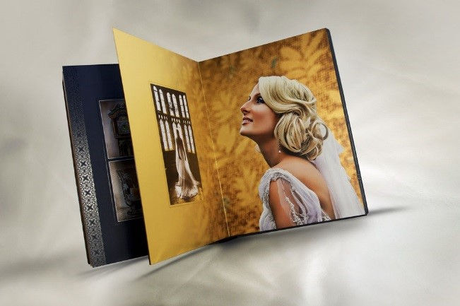
· The mood: This is another criteria to make a good image, to create a mood for the subject in the heart and mind of the viewer. Mood can be communicated based on a photo’s color scheme. To select a colour scheme, one may refer the Colour Wheel invented by the great Artist Leonardo da Vinci. For example, a cold tone can elicit a feeling of sadness or loneliness, while a warmer tone might suggest tenderness or joy. For example, the image where the kids are playing with a red ball is kept in colour, to highlight the mood of happiness. Also you may refer the wedding image in Pic3 above. But the old building, may be transformed to Sepia, to reflect the mood of an antique property. For example the Pic4 above.

Pic6: A colour image to set the perfect mood of Childhood Memories
It is important to emphasize the subjective of this issue. There are photographers who work almost exclusively in color, and those who work almost exclusively in black and white. Many more, however, fall somewhere in the middle and produce both color and black and white photos. So, it is important to keep in mind, there in no specific guideline or technical requirement of making an image Colour or Monochrome, its just few guidelines to the common question. Every photographer has his or her creative liberty to take the decision at his or her end.
To know more about colour space and gamot, watch the video: https://studio.youtube.com/video/zb_F7EYbqWU/edit


Comments